Colors That Shape Home Feelings

Today we dive into color psychology and palette selection for living spaces, translating hue, value, and saturation into everyday comfort. You will learn how warmth invites conversation, coolness restores calm, and neutrals stitch everything together, while light, texture, and finish subtly reshape your perception. Expect practical steps, heartfelt stories, and confidence to test, tweak, and share your choices with a supportive, design-curious community.

The Emotional Spectrum at Home

Colors quietly steer mood and behavior, especially where we gather, unwind, and create. Warm hues can energize and encourage connection, while cooler tones soothe and clarify. Saturation elevates intensity, and lighter values lift visual weight. By understanding these levers, you can tune comfort, productivity, and optimism without expensive renovations, simply by adjusting walls, textiles, artwork, and the balance between dominant, secondary, and accent notes.

Warm Hues and Social Energy

Sunlit terracotta, coral, and gentle amber can nudge conversations forward and make gatherings feel more welcoming. Use these shades where you want laughter, appetite, and lively exchange. Keep saturation moderate to avoid visual fatigue, then ground warmth with tactile neutrals like linen or oat. A single saturated accent, such as a paprika cushion, sparks interest without overwhelming eye comfort during longer stays.

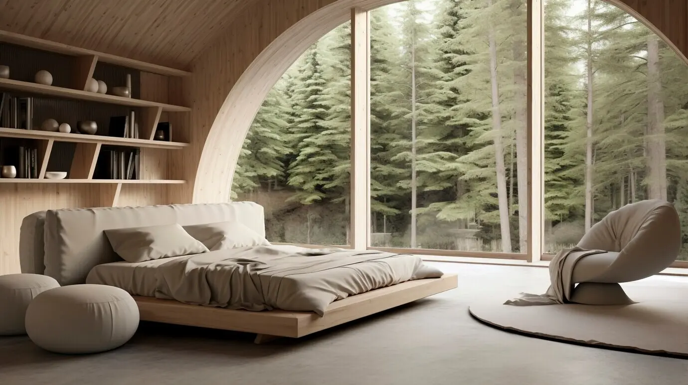
Cool Tones and Restorative Calm

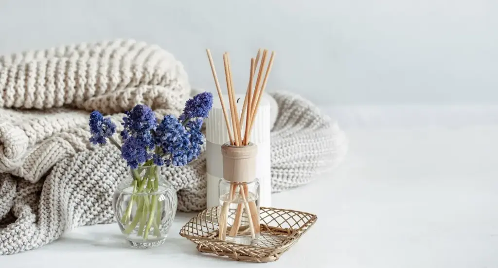
Powdered blues, misty greens, and soft blue-grays release tension and invite deeper breathing. Ideal for bedrooms or reading corners, these hues expand space psychologically and soften mental chatter. Add natural elements—plants, woven baskets, pale wood—to warm the coolness just enough. Avoid overly icy finishes; a hint of gray or green in the undertone feels human, steady, and quietly supportive across seasons.

Neutrals as Breathing Space

Neutrals create visual pauses, letting bolder notes shine while keeping rooms gentle on the eyes. Choose nuanced variants—greige with violet undertones, cream with a whisper of peach—to harmonize with daylight and furniture. Layer texture through boucle, nubby linen, and matte ceramics. Neutrals aren’t boring; they are the canvas that lets stories unfold, photographs sing, and seasonal accents transform without repainting everything.

From Inspiration to a Cohesive Palette

Collect images from travel, nature, and favorite objects to reveal patterns in your preferences. Then distill those intuitions into a balanced set: a dominant base, a supporting hue, and a lively accent. Consider the 60-30-10 guideline as a flexible starting point. Evaluate natural light and adjacent rooms, preview finishes in place, and commit only after observing swatches morning to night for several days.

Rooms That Feel Right

Living Room Conversation Flow

Encourage sociability with grounded warm bases—soft camel or clay—then add conversational accents like rust or teal in art and throws. Balance lively seating with calm walls to prevent fatigue. If the room is small, keep larger pieces lighter and matte. Anchor with a dark element, such as a charcoal rug border, to stop the palette from floating and to emphasize cozy intimacy.

Bedroom Sanctuary and Slow Evenings

Lower visual stimulation with muted blues, feather-gray greens, or subtly warm off-whites. Reduce sharp contrasts near the headboard and use diffused lamp light to soften edges at night. Natural fibers breathe and add tactile calm. A single deeper hue—ink blue or forest green—on linens or artwork creates cocooning depth without heaviness, supporting unwinding routines and more consistent, restful sleep patterns.

Kitchen Creativity and Everyday Ease

Crisp, clean bases—soft white with creamy undertones—support cleanliness while avoiding sterility. Add appetite-friendly notes: olive on cabinetry interiors, a cinnamon runner, or apricot ceramics. Consider sheen carefully; too glossy shows smudges, too flat absorbs light. Under-cabinet warm LEDs enrich colors of food and materials. If experimenting with bold cabinet color, keep surrounding surfaces quieter to spotlight culinary action gracefully.

Light, Materials, and the Alchemy of Finish

The same paint looks different across daylight directions and bulb temperatures. Textures scatter or absorb light, and sheen transforms perception from velvety calm to crisp precision. Learn your room’s light behavior, then tune finishes—matte, eggshell, satin—accordingly. Pair open-grain wood with soft walls for warmth, or polished metal with cool hues for clarity. Let materials and color collaborate instead of competing loudly.

Reading Daylight by Direction

North light is bluish and steady, flattering cool colors but cooling warm hues excessively. South light is abundant and warm, brightening and sometimes yellowing delicate neutrals. East light sparkles in morning, while west light glows late and deepens reds. Sample generous swatches across walls, corners, and ceilings to map these shifts. Note where shadows fall, because shadowed areas often decide overall mood.

Choosing Artificial Light Temperatures

Bulb temperature reshapes palettes dramatically. Warm white around 2700K supports cozy evenings, while 3000K offers balanced neutrality ideal for mixed-use spaces. Cooler 4000K increases clarity for tasks but can feel clinical at night. Layer sources—ambient, task, accent—to control contrast and sparkle. Dimmer switches let color breathe across activities, preserving emotional intent while adapting to work, dining, and late-night unwinding.

Color Stories from Real Homes

Sometimes the most persuasive evidence arrives through lived experience. These stories show how modest palette shifts changed daily life—more sleep, better focus, easier hosting—without knocking down walls. Notice how light, materials, and proportion adjust the same hue’s vibe. Use them as springboards, then test generously in your home, collecting feedback from everyone who shares the space, including pets and plants.

Common Pitfalls and Gentle Fixes

Color trouble rarely means starting over. Often it’s too many competing stars, clashing undertones, or neglected transitions between rooms. Diagnose before repainting everything: adjust lighting, balance saturation, and introduce textured neutrals. Reduce visual conflict where eyes rest most. Swap one accent at a time, observe for a week, and invite feedback. Incremental tuning preserves budget, energy, and your growing design intuition.

Too Many Competing Stars

If every element demands attention, nothing truly shines. Choose one focal color and demote others to supportive roles. Tone down saturation on large surfaces and move stronger hues to textiles or art. Repeat a single note throughout—perhaps olive in planters and cushions—to create rhythm. The result feels curated, not chaotic, while still honoring your love of expressive, joyful color moments.

Undertones Hiding in Plain Sight

A gray might secretly lean purple; a cream could favor yellow. Place samples against your permanent finishes and white copy paper to reveal undertones. Compare side-by-side to spot subtle shifts. If clashing appears, pivot within the same family, not across it. Harmonizing undertones makes inexpensive accessories, like rugs and lampshades, suddenly cooperate, turning dissonance into a cohesive, calm background hum.

Forgetting Flow Between Rooms

Spaces communicate through doorways and sightlines. If each room tells an unrelated story, transitions feel abrupt. Borrow a color thread—trim shade, rug border, plant foliage—so movement feels intentional. Keep adjacent rooms within compatible temperature and saturation ranges. Even small echoes, like matching throw pillow piping, can harmonize the journey and reduce visual fatigue. Think sequence, not isolated snapshots, for lasting comfort.

Test, Iterate, and Share Your Progress

Drfuatkuram
Privacy Overview

This website uses cookies so that we can provide you with the best user experience possible. Cookie information is stored in your browser and performs functions such as recognising you when you return to our website and helping our team to understand which sections of the website you find most interesting and useful.